Using the Benchmarking Tool to Visualize Greenhouse Gas Emissions

In his State of the Union address last night, President Obama made a strong statement in support of addressing the reality of climate change head-on. Philadelphia has been tackling the crisis though a series of measures as part of Greenworks, including a focus on building energy use, which accounts for 60% of citywide greenhouse gas emissions.

One of the building-level metrics that we have not been able to capture until now is how much carbon is being emitted in Philadelphia’s largest buildings. Just launched last week, the Benchmarking Data Visualization tool not only provides assistance to building owners and operators to understand how their building’s energy use compares to its peers, but can also provide carbon emission comparisons.comparison

Using the mapping tool, the user can change the usage to show emissions among the benchmarked buildings.  The user can then filter the buildings according to building sector and choose a category to show buildings of a certain size, type or age.  A building owner, manager or tenant can search and compare their building emissions to up to three peer buildings.

You can also visualize greenhouse gas emissions from these buildings using the chart tool. Here, you can visualize building carbon emissions by sector, building age, building size and individual building emissions.

comparisonstats by building type

For more information about the Philadelphia’s energy benchmarking program and the Year Two Energy Benchmarking report, please visit www.phila.gov/benchmarking or contact benchmarkinghelp@phila.gov.

Philadelphia Releases Energy Benchmarking Visualization Tool

For the past few months, MOS has been working with local geospatial analysis firm (and B-Corp!) Azavea to help visualize the results from the second year of Philadelphia’s energy benchmarking program for large commercial buildings. Today, we’re thrilled to announce the result: a new web-based tool to assist building owners and operators understand how their building stacks up to its peers around Philadelphia.

Azavea screenshot
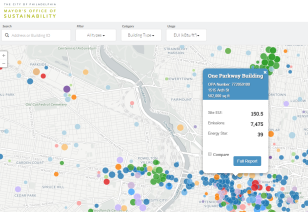
The Benchmarking Data Visualization tool is available on Philadelphia’s energy benchmarking website (www.phila.gov/benchmarking) or by clicking here. The tool has two primary components:

  • Mapping and Comparison: Building owners, managers, and tenants can find their building by searching for the property address or Office of Property Assessment ID number. After selecting a property, users can generate a report on the building’s benchmarking results or compare to up to three peer facilities around the city.
  • Charts and Graphs: In this section of the tool, users can see benchmarking data visualized by building type, individual performance, and (for facilities owned and operated by the City of Philadelphia) over time through a series of interactive graphing functions.

Azavea has designed the tool to be as user-friendly as possible. The goal of Philadelphia’s benchmarking and disclosure policy is to improve building performance by making energy data in the city’s largest buildings transparent and open to the public. Like other cities, MOS made this data public via spreadsheet last fall; this visualization tool represents the next step in opening this data up to the widest possible audience.

In addition to launching this tool, MOS is also releasing the full report from the second year of energy benchmarking in Philadelphia. This report follows the Executive Summary of results released last fall, and is available for download at www.phila.gov/benchmarking.